As a webmaster, you will likely experiment with animated and elaborate designs to create an amazing website that is beautiful and captivating. You are eager to include themes, images and media files that are mind blowing. So why does your website have little to no traffic?
You might have forgotten that the website needs to provide a great user experience and still be search engine friendly. The greatest websites are designed by optimizing them for both search engines and users. Your intention to cajole your visitors with an amazing web design might play out negatively to your surprise.
Never compromise on function over beauty or vice versa. Take a moment and ask yourself why you wanted to redesign or create the website in the first place. Was it to bring more traffic to your website and consequently more business?
Designing your website is the most vital aspect that will help you increase sales. What is the point of taking the time and bearing costs to design a website that does not appear in search engine results and is not user-friendly?
If you already have a website or are looking to create one, keep reading this and discover six common web design mistakes that hurt SEO and prevent high ranking of your pages in search engines. You need to find the balance between a search engine friendly and elegant website.
1. Missing H1 Tags and 404 pages
You have taken the time and effort to design your website with a captivating background, color scheme and a user-friendly font. It looks awesome and browsing through it is simple. Too bad it won’t pop up on search engines.
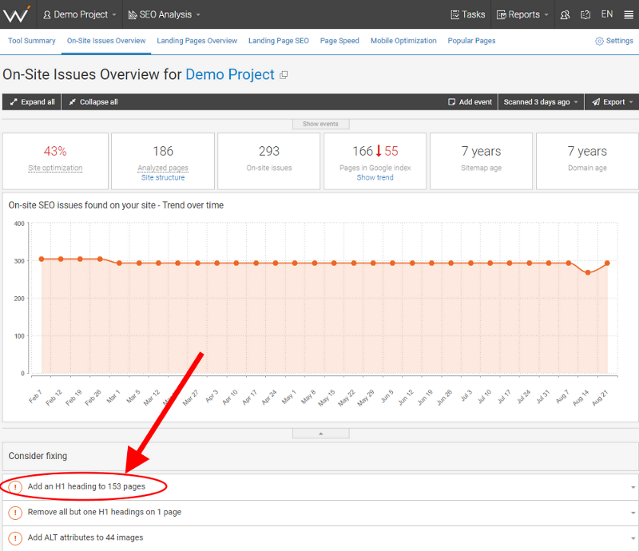
Why? Because you have forgotten all about the vital SEO elements such as the H1 tag. Search engine crawlers will first look at the H1 tag to find out what the webpage is about. Including this tag will improve your chances of a high ranking. This is especially true on the home page.
“The search engine crawlers will first look at the H1 tag to figure out what the page is about. By using the H1 tag, and including your target keyword, bolsters your likelihood of ranking higher. Often, the simplest way to explain the purpose of the site is with a descriptive H1 tag above the fold”, says Katya Bovykina, digital marker at Resolver.
Click on the image to view it in full size.
Take a five-second test to find out if an H1 tag will improve your website. If a user can effortlessly tell what the website is about after five seconds, it has a good user experience. An H1 tag is generally the best way to explain the website’s purpose. The tag should be descriptive and above the fold. Remember as well: Google gets confused if you have more than one H1 tag per page.
One other thing. Guess what happens when a visitor types a wrong URL or visits your website and is met by a broken link? Yes, that’s right. They are unlikely to come back.
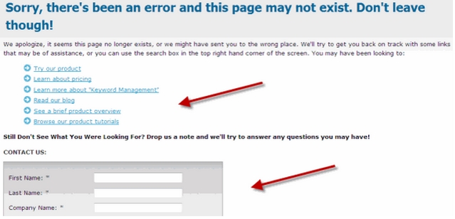
You will need to enhance the user experience, especially for these users, so that they can remember your brand. On the 404 error page you created to catch broken link traffic, do not forget to add a link back to your best landing pages. A tool like WebCEO’s Internal Link Analysis Tool can be invaluable in identifying and fixing these broken links.
A broken link without the right navigation choices is not only bad for UX, but it can also eventually result in a loss of ranking in the SERPs.
Never leave a visitor in confusion when they accidentally land on your 404 page. Craft a 404 page to re-engage your unhappy visitor.
2. Large Media Files and Images
How many images do you have on your website? Beautiful and high-resolution images make your website look awesome. However, you will need to be wary of the size of the files. Large images and media files slow down your sites’ speed. Consequently, this can lead to slower loading time and lower rankings.
So, how can you tell if the media files on your website are large and how do you fix them? Google PageSpeed Insights Test is a tool that you can utilize to find out exactly what images Google deems to be too large on the webpage. In addition to this, you can utilize WebCEO’s Website Audit tool. This comprehensive audit can help identify large media files and provide suggestions on how to optimize them for faster loading times.
Screaming Frog is another tool you can use to find large media files and images on your website. Properly compress and format images to make their size smaller.
3. Not Mobile Friendly
Statistics have shown that 78% of local mobile searches lead to offline sales and those consumers spend 69% of their time on mobile.
In 2015 when Google rolled out an algorithm update, to demote websites that were not mobile-friendly, mobile-friendly websites saw an average of a 12% increase in visibility on Google mobile results.
Although this is not an official factor for rankings, it is Google’s recommendation to webmasters that they make their websites mobile friendly.
A responsive website design offers a dependable user experience to all visitors regardless of which device they use. This is because the display renders differently depending on the user’s device. A responsive web design also reduces bounce rate and increases user engagement. MailChimp, GetResponse, and AWeber are marketing service providers who offer a responsive template that you can utilize to create a great user experience for mobile users.
So, how do you make your website mobile friendly?
Content management systems: If you use a content management system such as WordPress, select a responsive theme to vastly improve your WordPress SEO. You can also use marketplaces such as ThemeForest and StudioPress to purchase responsive themes and set the filter to ‘mobile responsive.’
“Ensure that your web design incorporates other specific user requirements, such as account logins and shopping carts. Once you complete the responsive web design, test the website, you can restrict downloads of large images and set up a limit for the number of HTTP requests”, says Lawrence Jones, digital marketing manager at A Plus Digital.
Use these 3 webmaster tools to pass the mobile-friendly test.
A. Mobile Optimization
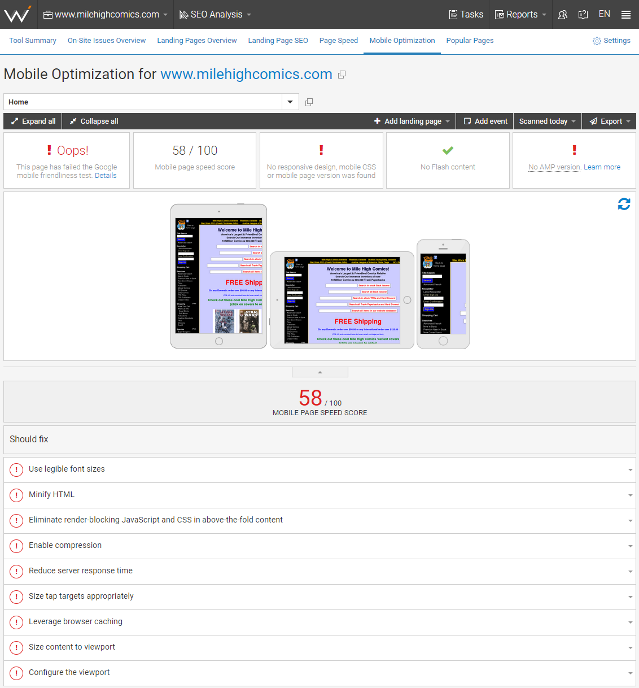
This simple test requires you to create a project for your website in WebCEO and select the Mobile Optimization tool. A green message in the top left corner indicates that your website has passed the test. If your website is not mobile friendly, you will get suggestions on what corrective measures to take.
Click on the image to view it in full size.
B. Robots Testing Tool
One single robots.txt error can lead to an astounding drop in search visibility. This tool will indicate how Google crawls your robots.txt file. Any errors will be reported.
C. Page Speed
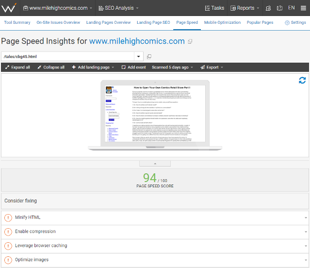
Mobile devices have slower internet connections. A split second delay might make all the difference in a business website. WebCEO’s Page Speed tool grades your website’s speed and gives recommendations on increasing it.
4. Text in Images
Text remains as the content that search engines comprehend most easily. Yes, sharing images, podcasts and videos to your visitors might make them happier and help with better engagement. However, search engine crawlers also crawl media files by looking for keyword phrases in important locations.
This mistake is surprisingly widespread. Most people put text into an image rather than include a text layer over the image. You might ask, is that so bad?
To begin with, search engines are not human and cannot see the image the same way. They cannot read the text on an image, and basically, it is as if the text is not there at all. When designing your website, always remember that search engines ignore this content. Text in images on a mobile device, appear diminished, and the user experience is poor.
“You should use text instead of images as much as you can to display essential names, content, and links. If you must use an image, you should include descriptive test by making use of the ALT attribute. If you replace your text headers with images, your content may appear great. However, for search engines, text is an important on-page element that can help them understand your content’s keyword phrases”, says Neil Patel of QuickSprout. To ensure that your website is effectively optimized for both search engines and users, consider using WebCEO’s SEO Content Assistant. This tool can help in determining if your content, including the use of ALT attributes and keyword optimization, is aligned with SEO best practices.
Read more from an excerpt in the official Google webmaster guidelines. Your title, meta description, and keyword phrase density are important SEO essentials for your webpage. A convincing SEO title and meta description will definitely make you gain better CTR.
According to Roman Bebenista, if you optimize your website for graphics, the improved image results in the SERPs could bring you 20 to 60% of all your traffic from Google.
Here are 4 tips to optimize images for your website
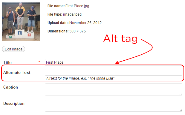
- Use the ALT attribute to accurately and concisely describe your visuals. This will assist the search engines to be aware of what the image contains.
- Google suggests that you ensure that every page in your site is accessible from a minimum of one link.
- Share important business information such as your business address and contacts directly using text. Do not use the header or footer feature on your website for this.
- Use descriptive names for your images such as the-best-ever-marketing-tool.JPG instead of IMG0008.JPG. Also, consider hosting all your images.
The same goes for other media files such as videos. Always provide the meta descriptions. Google will determine the relevance of your video content using the surrounding text, transcript, meta information, and caption shared. However, the quality of the content in your videos is what will engage and build a loyal audience. Do not configure your video pages with complex hash, flash and JavaScript tags.
5. Infinite Scroll
“This is a popular web design strategy that if incorrectly done can hurt your SEO ranking big time. An infinite scroll allows more content to load as the user reaches the bottom of the page. If you do not set your pagination correctly, search engine crawlers won’t be able to find your pages,” says Andrew Sirianni, SEO expert at Dcode Group.
For instance, you have enabled infinite scrolling in your 50-page article. If by default, you only show the 5 most recent posts, that is what the search engines will see. Since the search engine only crawls using links, they cannot know that the page has more content past the top 5 articles.
However, the infinite scroll can be made user-friendly. Google Webmaster Blog offers tips on using infinite scroll without compromising between SEO and design.
If you don’t know how your website is viewed by search engines you can use tools to determine how search engines see your website such as SEO-Browser.com. This tool will give you a clear picture of the visible and hidden elements in your website.
6. Thin Content and Popups
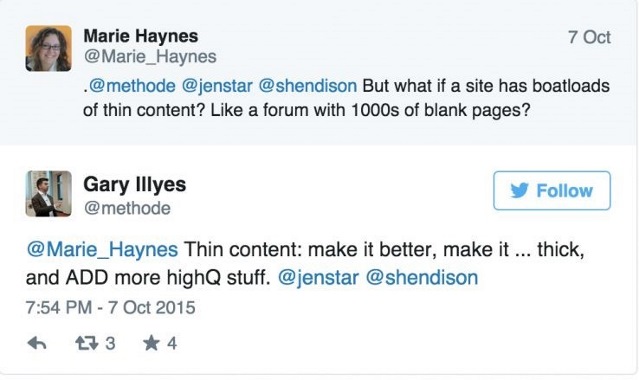
The most crucial pages on your website are service and product pages. If you can get higher ranking for them, you will get more business. Plain and simple.
Here are some common mistakes associated with thin content:
Lack of a product/service page on the website: By eliminating service and product pages from your website you miss out on an opportunity for your target keywords to rank organically.
Listing several services or products on one page: Listing multiple services or products on the same page confuses the search engines and lead to poor rankings. Having one keyword/listing per page is the best practice. This makes it easy for the search engines to tell what the page is about.
Having sparse text on your product pages: Once you decide on which pages to incorporate on your website, take some time and think about the copy which will be part of each page. Include descriptive content that includes the benefits of buying from you for higher rankings on your pages. This also raises the chances of turning visitors into customers.
It’s important to avoid popups on your website. When a user accesses your website, and before they can even get a chance to read the main content, popups appear, it can impact your rankings negatively. Popups are considered a must-have tool for increasing sales and email signups. However, popups should not be intrusive but enhance the user experience.
Review your popup strategy, particularly if there is a decline in traffic to your website. The key is to make them relevant and unobstructed by offering value to the user so that they don’t feel the intrusion. You can try the following tips on your popups to offer value to your users.
Show social proof of the people who have subscribed whom the reader may recognize.
Offer incentives such as a free trial period or a free eBook.
Offer your product at a discount.
Present the popup at the end of a read.
Show the popup when a user signals an exit from the website.
Summary
Work interactively with your team of SEO strategists and web developers and designers to create a seamless website that will provide the ultimate user experience. Whether you are redesigning your existing website or creating a new one, always avoid the common mistakes that could hurt your SEO.
