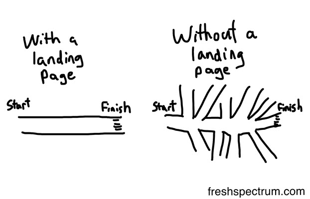
There are 3 major types of landing pages and each serves its own goals.
Let’s imagine you own a huge supermarket. First you can segment this into departments, i.e. canned goods, boxed goods, produce, home supply department etc. This is a must because, when people visit a supermarket, they go straightway to a specific department because they have specific shopping needs. This is how your website should be built. Your home page is a showcase of your site and the landing pages that describe your product features and solutions are specific departments which attract targeted traffic that is generated from specific search queries. If a visitor’s search intent has a transactional character (she wants to buy a specific item over the Internet), you wouldn’t want to send a visitor to your cluttered home page but, instead, you would send her to a product description page with pricing and a clear call-to-action in order to get more conversions.
The key objective of landing pages optimization is to narrow down and capture targeted visitor traffic and turn this into prequalified leads and ready-to-pay customers. But messages and the ways to attract traffic with the help of landing pages are different.
For example, if you have a website dedicated to online marketing services, you can build a specific internal website page that will cover one of the solutions you provide, be it SEO, or email marketing, or social media marketing. These internal website landing pages, if optimized properly, will show up in organic search results.
If you launch a PPC campaign via Google Adwords, Social Media ads, or via email marketing campaign and your goal is to provide a sales pitch, you can create a PPC landing page with sales-dedicated copy with a clear offer and above-the-fold call to actions.
And finally, if you launch a free content giveaway campaign or a viral campaign via a blog post or social media and your goal is lead generation, your landing page should have rich copy with unique and helpful content and with link incentives for users to share their contact details or get in touch via an inquiry form. This type of landing page is called a lead capture page.
Anyway, all roads lead to Rome. No matter what the goal, how much money you spend and what way you choose to bring targeted traffic to your site, your landing page should convey a high value, strong incentive with solid benefits.
Bite on this: According to Omniture: [Tweet “Marketing campaigns that use landing pages as target pages improve conversion rates by 25%.”]
To give your landing pages high conversions, follow these step-by-step recommendations.
1. Do keyword research to match a searcher’s intent with the topics of your landing pages.
Whatever type of landing page you choose, the first thing you should do is find user matched and SEO-friendly keywords. Users have short attention spans; it takes about 2 sec for them to click your result or not in the SERPs. So you should definitely use the keywords that closely match a user’s search intent with the key concept of your landing page.
An effective action plan for your landing page keyword research includes brainstorming and the refinement of a complex list of keyword phrases and long-tail keywords based on:
- Brand terms
- Generic terms
- Closely-related terms (synonyms)
- Competitive terms
There are a lot of useful keyword research tools on the web, like the Google AdWords Keyword Planner (great for PPC keyword search and analysis), the Bing Keyword Research Tool, KeywordTool.io, the WordTracker Keyword Research tools etc. Most of them provide in-depth keyword suggestions and estimates of their search volume. Most keyword research tools fail to easily integrate your work on your keyword lists with what necessarily must follow: landing page optimization and keyword rank tracking.
Unlike these great but insufficient tools, the Web CEO Keyword Research Tool embraces four stages of keyword research:
Shape keyword suggestions
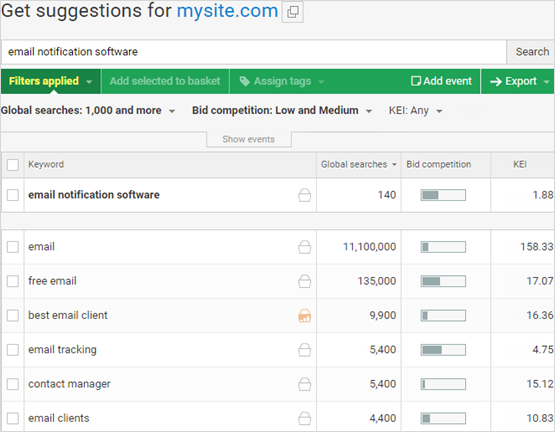
Sign up to Web CEO, add your website to our Add New Project wizard and start with finding the most relevant and profitable keyword suggestions in the Keyword Research tool → Get keyword Suggestion tab
With the help of special filters you can narrow down your suggestions in order to pick only those with 100+> global searches and low bid competition. Add your selected keywords to the Keyword Basket
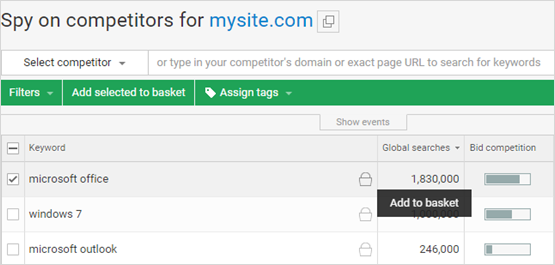
Add terms used by your competition
Spy on your competitors targeted terms by adding a competitor’s domain or even specific landing page URL. Then add newly selected keywords to the basket.
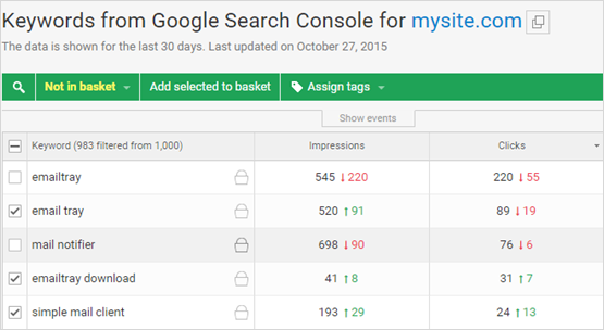
Back this up with Google data for your website search queries
Use the search keywords that searchers have already used to reach your site. You can see how many impressions, clicks, CTR and the average position they had on Google over the past month (note that the WebCEO Rank Tracker tool itself provides fresh ranking data). Add them to the basket as well.
Refine your keyword list and assign tags
Once, you have selected your keywords, go to the Keyword Basket in order to get them in taxonomic order. With the help of the tag manager in the Web CEO keyword research tool, in every stage of keyword research you can assign tags to keyword family groups by, for instance, landing page goal and intent, language, or relevance and significance. It will be much easier to optimize you landing page content, once you have shaped your keywords spreadsheet into topical clusters via tags.
2. Put in order your keyword-to-page relationships
When you’ve finished grabbing and tagging the most profitable terms and long-tail keyword tag clusters, you can start to align them with your landing pages to make them SEO-friendly. You should focus on using 2-3 primary keywords for each page. No matter what the length of your landing page copy is, the goal is to add your targeted keywords wisely and match them with the topic of your page. Focus keyword mapping on sensitive SEO areas in order to establish your landing page theme and match your message to a user’s search intent. Sensitive areas are:
- URL: fill your landing page URL address with your 2-3 targeted keywords for that page in order to communicate the landing page’s semantic core to search engines.
- Title: put the targeted keywords (phrases) at the beginning in order to communicate the message of your landing page content (its offer). The Title tag should not exceed 55 characters;
- Headings: put keywords in H-tags to improve their search value, be sure to not have more than one H1 tag per page;
- Image name and its ALT attribute: use a targeted keyword in both the image file name and ALT tag to get additional ranking power, especially in image search, and make visual content SE-readable;
- Meta description: transmit your landing page message and value to search engines and searchers with a keyword-rich description tag (it should not exceed 160 characters).
3. Check your landing page SEO for weak spots and fix them
Ok, your obedient keywords are now in their places. Before it’s too late and you lose your targeted traffic, make sure that you have properly conducted keyword mapping within your landing pages.
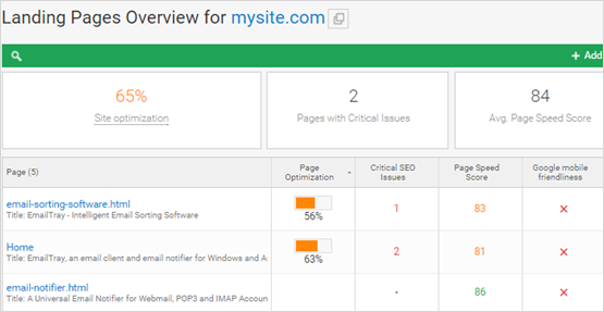
The easiest way to do this is to run your Landing Page SEO Analysis with WebCEO at hand:
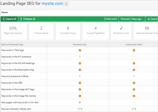
Run a Landing Page Overview that will help you take a quick view of all your landing pages’ SEO performance (i.e.: critical SEO issues, page speed score, Google mobile friendliness, broken links, backlinks and social citations)
The more specific Landing Page SEO report will provide you with a detailed look at your keyword placement within any given page as well as other SEO issue details for that page. If you see a low keyword optimization score, you can either reconsider what keywords the page should be optimized for or go into your HTML and properly add your chosen keywords into the proper meta tags, etc. All the SEO issues you will find will come with detailed advice on how to get them fixed.
4. Match your landing page copy with design elements and layout
A well-designed landing page with a logical structure flow is crucial. It takes only several seconds for a visitor to fall in love or not with your site (plus the time to load a page). When you come to the design of a landing page, your key objective is to make it simple, short, uncluttered and persuasive. When you give too many visual focuses, you will cause them to get distracted and uncertain on their way through the conversion funnel. So, you need to give them one task and provide them with logical grounds for their decision making. Here are 5 must-have design elements that will help you tell your story and grab a user’s attention in order to make him or her complete your desired action.
- Your company logo at the top that builds strong brand awareness.
- A proposition-focused headline that tells what your product focuses on.
- A sub-headline that explains what your product can do for users.
- A topic-related image that transmits and supports the message of your proposition.
- Benefit bullet points for your proposition.
- Relevant and prominent call-to-action buttons that clearly describe what will happen upon clicking.
- Lead capture form use where appropriate
- Social-proof accolades (testimonials, case-studies, embedded social media posts and social media buttons that open to your popular social pages in separate browser tabs)
While you put the main focus on the simplicity of your landing page visual and content elements layout, you should avoid any negative distracting clutter such as:
– Menu navigation with too many sidetracking links
– Too many call-to-actions per offer
– Too much text
– Freakish hard-to-read fonts
– Lack of white space
Keep in mind that the biggest enemy of your landing page conversion tally is the browser back button. You should put all your effort into making users click on your call-to-action buttons instead of the dreaded browser back button.
If you are in a startup and have no designers to help you build and customize landing pages, Instapage would be of great help to you. It allows you to create mobile responsive landing pages from scratch or based on existing templates, publish on your domain, integrate with a CRM, conduct email marketing and work with other third-party tools, as well as monitor your performance and conversion analytics and run A/B split tests.
5. Streamline your landing pages with the Google mobile-friendly guidelines
In 2015, mobile searches officially surpassed desktop searches. Unless you into business suicide, you will want mobile-friendly versions of your landing pages with a slightly different message in some cases. The fact is that mobile users are more goal-driven, while desktop users are more benefit-driven in their intention. It’s in your power to make your landing pages kindly welcome mobile users with a positive user experience. Meet the following requirements for a better mobile-optimized landing page in order to increase your mobile landing page conversions:
Content
- 3-4 word succinct headlines
- Short actionable call-to-action buttons
Design
- Orderly single-column page layout
- Negative (white) space between clickable elements
- Legible fonts (16 pixels)
- Color contrast between text and background
Usability
- Light-weight page size (less than 20KB)
- Top-oriented and clickable call buttons
- Content accessibility (no flash, frames and plugins)
- Thumb-friendly touch targets (eliminate zooming)
Read more about Google’s requirements for mobile-friendly content in this mobile issues checklist
Tip: Plan your landing pages with mobile search in mind, so you don’t have to scale down your content and layout after the fact.
6. Verify which landing page layout works best with A/B testing
No one likes landing page bounces and exits. You will experience them until you find out why you fail to convert visitors who come to each landing page. A/B testing is a great trial-and-error method for landing page conversion rate optimization.
Set up your original landing page as a control and start running experiments against it. There are five elements of a landing page you can control and test to improve your landing page performance.
- Headline + subheadline
- Copy length
- Image
- The call-to-action
- Form fields
- Explicit directional cues (arrows, pathways etc.)
Read more about some of the aspects of A/B testing for landing page optimization in this post written by our Product Manager and regular WebCEO blog contributor, Helen Vozna.
Secret hack from WebCEO: With the help of the WebCEO Rank Tracker you can spy on your competitors’ organic and PPC landing pages. Go to Competitor Rankings by Keyword and click on a keyword that is related to your landing page topic. You will see the SERP cached results with the links of your competitor landing pages. Analyze competitor landing pages and find hidden opportunities for your headline copy or call-to-action A/B experiments.
