In my childhood, there was a popular poetry book with the subtitle “for naughty children only!” From this book you could learn that it is OK to jump out the window with your mom’s umbrella, or that you can draw a portrait of your granny on a wall as a birthday present for her. “There are naughty children who always do exactly the opposite of what they are told to do. For these children the book has been written.”
I found this book when I visited my parents on Christmas vacation and immediately had an idea for a blog post! Let’s imagine what fake SEO advice your competitors would be happy to give you.
1. Test your site on your own monitor only. If your site looks good on your own computer, it will look good on all devices.
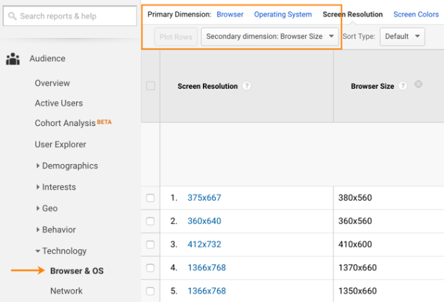
No, it won’t. Today desktop screen resolutions vary widely, and that’s without mentioning mobile devices! You should ensure your site visitors have the best experience using your site on their devices. To do this, go to your Google Analytics → Audience → Browser & OS. Here select “Screen resolution” as a primary dimension and “Browser size” as a secondary one.
This report will show what screen resolutions your visitors have. Now you can see your site through their eyes. If you use the Chrome browser, as I do, you can use the Resolution test plugin or any other tool that lets you imitate different screen sizes.
2. Make the website load slowly to make your visitors spend more time on it.
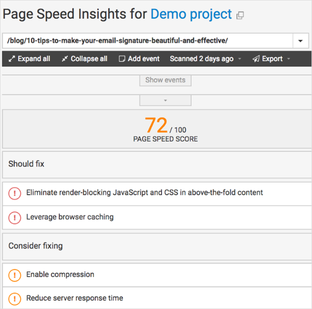
Slow pages annoy both search engines and visitors. The content of your site is the power that can involve users and keep them on your site. How will you know if your site pages are fast enough? Use WebCEO’s Website Audit Tool and check the Speed Optimization report.
The best advice is: “Check the page speed score for all your important pages and fix the issues WebCEO has found.”
3. Give your visitors more choices.
Well, this one is tricky. Having choices is considered a good thing. However, the more choices a website offers, the harder it is for a visitor to choose something.
Hick’s Law says that increasing the number of choices will increase decision time logarithmically. A user overwhelmed with choices often decides to leave. The “jam experiment” provided by Sheena Iyengar and Mark Lepper proves this. If you are not familiar with the experiment I will retell you in brief: it was found that consumers were 10 times more likely to purchase jam on display when the number of jams available was reduced from 24 to 6. More choice, fewer sales.
How to use this knowledge on your site:
- If you want your readers to share your content, give them a limited number of ways to do so. Just pick the most important social sharing icons and not clutter your site with the rest.
- On a landing page, don’t try to make the entire sale; instead, convince visitors to take one action. Remember, that a single offer asks customers to make one decision.
- Don’t try to display all your options on a home page. Leave only the most important ones.
4. Optimize different pages for the same keywords.
Keyword cannibalism is still a thing. The problem of having multiple pages targeting the same keywords is as awful as it sounds. Why is it a problem?
When each page of a website is focusing on the same set of keywords, search engines need to choose which page is more relevant for optimized query and decide what page to show in SERPs. This means that pages that should convert visitors into clients will compete with the whole internet and even other pages of your site!
To avoid keyword cannibalization, decide which pages on your site you should optimize for which keywords. WebCEO’s Keyword Research can help you to find the most effective keywords that will enhance your website’s visibility, attract a targeted audience, and improve your search engine rankings.
5. Use more & more pop-ups to grab visitor attention.
In 2004 pop-up windows were called the most hated advertising technique – 95% of users asked by John Boyd from Yahoo! and Christian Rohrer from eBay rated this technique the most negatively. Over the past few years, pop-ups have re-emerged as a popular marketing tactic for growing email lists, promoting content and lead generation.
Do you need those passive-aggressive pop-ups to get more subscribers? Some AWeber research shows that a pop-up subscription form drove 1,375% more subscriptions.
Surely we do not call to sacrifice site performance for user experience. We call you to create only user-friendly pop-ups that convert users!
- Think about how people interact with your site and show pop-ups only when they are appropriate. For example, you can suggest that visitors subscribe to new blog posts when someone scrolls down the page as she reads the content.
- Offer something valuable. You can offer a free ebook or a coupon code for a person who spent a specific amount of time on your pages.
- Don’t ruin the mobile experience. Pop-ups are so distracting on mobile devices that Google even promised to penalize sites for using them.
Share your best “fake SEO advice” in comments!


